Transforming Tether
How I re-designed an agency focused bug reporting tool to cater to a wider audience


Role
Product designer
Timeframe
2 months
Tools used Figma / Figjam / Typeform
The challenge
Tether initially catered to agencies, but a strategic decision led us to pivot its functionality to better align with the needs of SaaS companies.
In my role as the product designer at Tether, I undertook the task of refining the existing web app to suit this new audience and spearheaded the design of Tether's first mobile app experience.
Exploration + research
Research began with stakeholder and user interviews, as well as familiarizing myself with the competitive landscape.
Interviews
Interviews were a critical part of my process. I needed to understand what features weren’t working for SaaS teams, and what features they were missing.
Simultaneously, stakeholders within Tether took center stage, contributing invaluable insights. As I geared up to introduce new features, their guidance became instrumental in anticipating how these changes might intertwine with various facets of the company.
“A centralized bug reporting tool not only helps us address current issues but also provides insights into the evolution of bugs over time.”
“Quick and efficient bug resolution is vital. A tool that provides real-time notifications about critical issues allows us to stay ahead of potential hiccups.”
Key takeaways
Currently, there’s no way to understand the status. Tracking bugs and feedback needs to feel familiar.
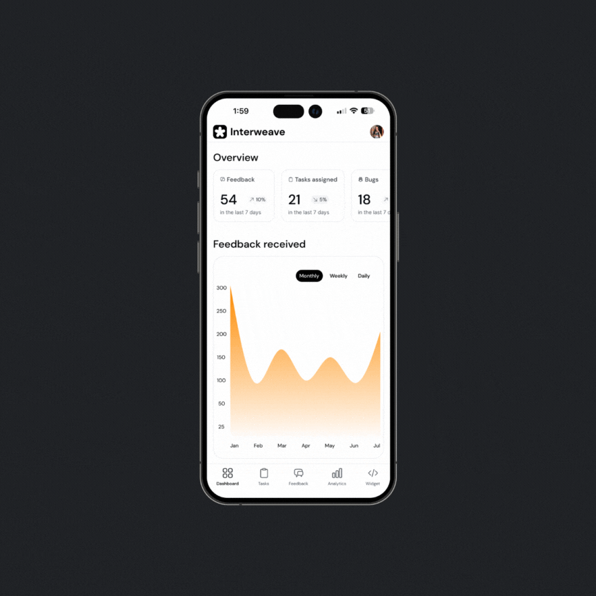
Looking back at previous data relating to bugs and feedback is important. Users need historical information to make informed decisions.
Users are in need of real-time notifications. Email notifications alone are not cutting it.
Empathizing + ideating
By building empathy for our users, I could strategically prioritize features and shape designs that resonate on a meaningful level.
Personas
Based on the interviews and research I conducted, I created three personas: Casey, Nicole and Malik. Each persona represents different user within the SaaS team and helped me to build a deep understanding for their
With a deep understanding of developers' workflows, we built out an experience to view past bugs and suggestions. Building out the personas made it clear that viewing bug history is important to one of our critical personas.


Design
Paper prototypes allowed the team + I to quickly align on important design decisions. We agreed that minimal CTAs, hidden filters and intentional feature organization would be critical to keeping the experience frictionless.
A new design system
Creating a new design system was a crucial part of enhancing the user experience. Before the re-design, the product was weighed down by cluttered color palettes and busy screens.
To combat that, I created a design system that cultivated a clean and stress-free environment for the user to discover. Feedback pages are text-heavy, it’s important for the UI to cater to that.


